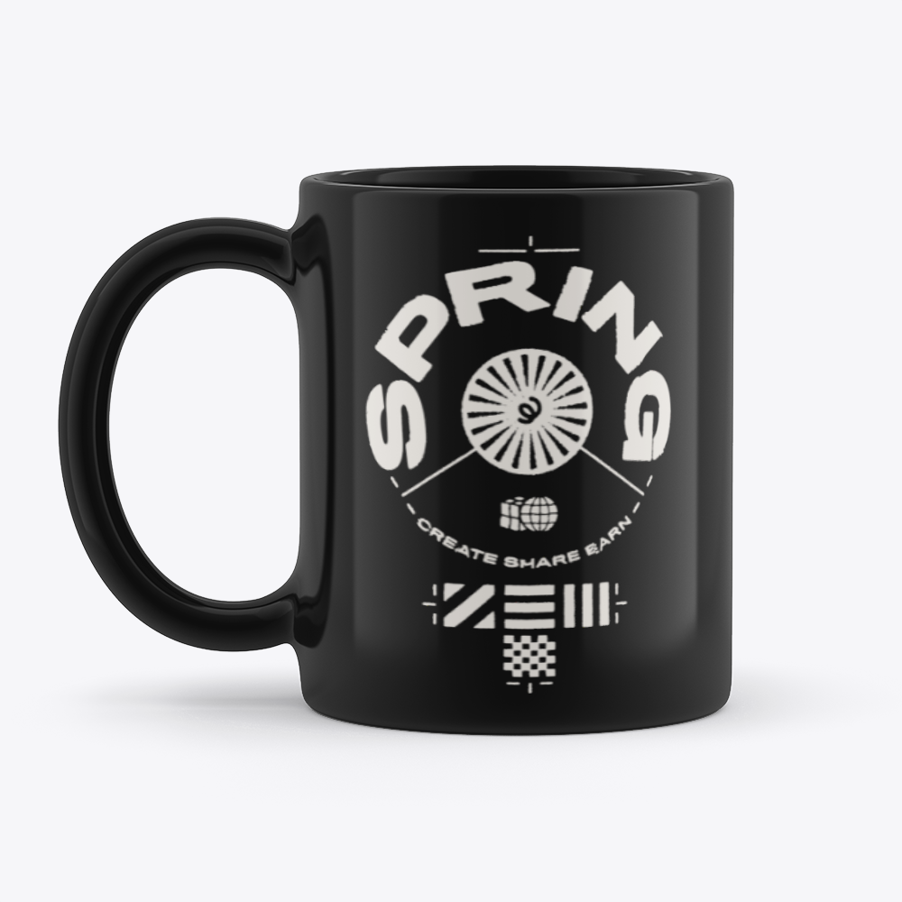
New black mugs: tips for nailing your design
We’ve added black mugs to the launcher—but there’s a few differences you should know when creating your design.
Long-awaited black mugs are here. Read through the tips below to make sure your design looks exactly as you imagined.
The printable area
Let’s start by explaining how it works. The entire mug is black, but the actual printable area is white. During the sublimation process, the white sublimation area is filled with your artwork, and the “negative” areas of your design will be printed black to match the mug.

Use an off-white color palette
If there are white elements in your design, those areas will not have any ink applied. They’ll be treated as ‘empty’, meaning the white printing area will show through instead. Ideally, you don’t want this—ink may also bleed into the white background area. If you have white in your mug design, we recommend making it off-white, rather than a true white color.

Keep it simple
Since any negative space on your design will be filled with black ink, intricate prints may appear less crisp due to bleeding from the black ink. Keep your design bold and simple—this way, it will look more effective once printed.
Design effect don’ts
Also, we know it’s tempting, but refrain from applying effects when preparing your design. It won’t look great when applied to your mug and will often degrade the quality of your print. Examples of these effects might include:
- Drop shadows
- Spray paint effects or gradients
- Low opacities—stick to 50% or higher
Avoid designs with straight edges
If you can, try and avoid using designs with perfectly circle or square shapes. They may look warped when placed on a round, cylindrical product like a mug.
That’s everything you need to create a 10/10 design. Head to the launcher below to start.